Why I Rebranded My Already Established Business
You might be wondering why the heck I'm sharing a "rebrand" for my business, but I'm here to tell you why!
If you're a creative business owner (and happen to also be a designer), you will relate to me in the regard that over time we truly find who we are as people, artists, and as a whole. My brand has been in the making since 2013 when I started creating coffee filter flowers and sewing baby bodysuits to sell on my little Etsy shop.
At that time, I had no clue what I was doing but I was all in with the whole "entrepreneur" thing.
But I didn't stop. I kept creating, I kept dabbling, and eventually, I found myself falling in love with photography and all things website design.
I am SO excited to share the gorgeous new brand that I have been working on behind the scenes for these past few months. I invite you to cruise around the site to see how I incorporated it into my existing site and continue reading with a peek into my creative process in the snapshots below. I hope you love it as much as I do! *If you love it, please hover over the graphics and save to Pinterest!*
COLOR INSPIRATION mood board
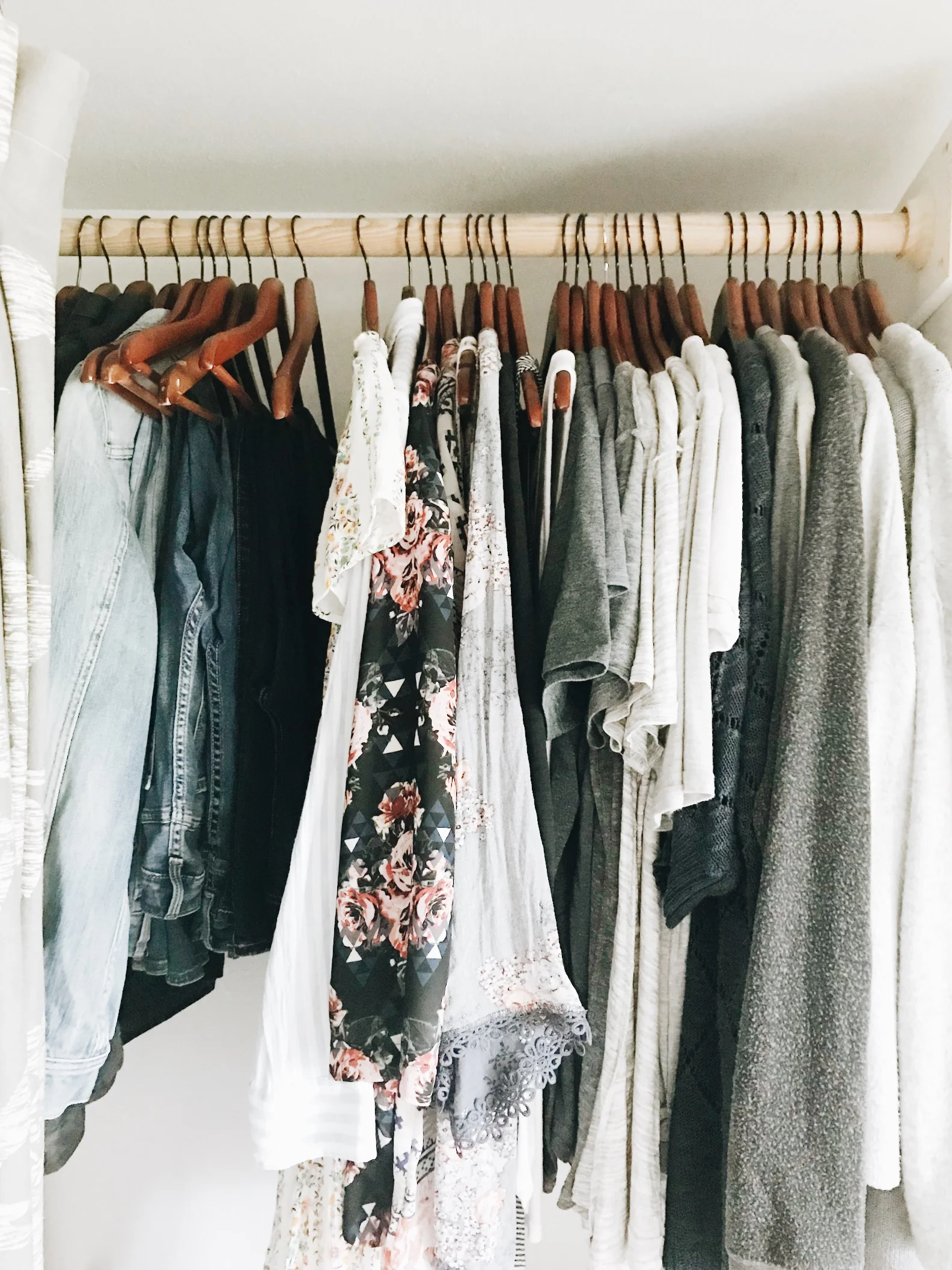
While I do consider my photography COLORFUL, I feel entirely differently about my overall preference for the design process and my true to life, daily life. If you view my closet, you will basically see all gray with a few shades of other grays, some lighter grays and about 2 floral things! (A post for another day is that I recently started a year round capsule wardrobe and my closet has totally been cleansed and it feels AMAZING!) Anyway, walking through my home you will also see a pattern... white and gray with pops of color coming from things like a lampshade, rug, throw blanket or pillows. Here's a picture of my new closet! I have 38 total pieces (excluding workout clothes and essentials like underwear, bras, socks, etc.) The drawers below are all my little bathroom accessories. This is totally off subject but if you're looking for a way to feel so much happier with your wardrobe, DOWNSIZE!
back to the point: when it came to my brand and who I want to reach, it's the creatives who value simple yet intricate.
Simple can be SO beautiful if done well and that way my goal here with my new brand. The only color that changed with my rebrand was a shade of gray. Otherwise, the color palette has stayed in tack, I've simply changed out some elements and redefined my exisiting branch created by The Wells Makery, turning it gray. I invested a LOT in my original logo and at the time it was a big expense for me and I absolutely love what they created for me, but it came with a few problems, too.
My biggest issue with my logo over the past few years is legibility. It's gorgeous, it flows, but it's very fine and difficult to read in given situations. Also, I found it incredibly difficult to incorporate such an important part of what I do which is describing my business name and services. With the fine script, the designs I'd try to incorporate to include "Company" or "Website Design and Photography" just looked bad with the greenery. I need my name and my services to be more recognizable, especially as I've really started to transition into make website design my main focus with my business. I'm sure I'm going to receive plenty of comments or suggestions that I shouldn't have changed a thing, and I will hear them out but the truth of the matter is simply that I know my brand and I know my business and I know that it needed this change.
Of course with a rebrand of any sort involves a ton of back end work but I couldn't think of a better time to make a change as I just hired my first assistant!
Logo Variations & Inspiration
This is all new territory for me but the fact of the matter is that I need help. I've finally been able to recognize all the things I'm missing because there isn't enough me to go around when it comes to all the tedious little tasks behind the scenes to keep my business running smoothly. Hiring my assistant has in turn forced me to really start focusing on some clean up things that have required a ton of time but have also completely transformed the way I run things and the experience my clients will get with me. I'm passing off things I truly love and enjoy doing for my business, but they take me away from what's important which is capturing new leads, giving my clients 100% of me all the time and creating content. I have so many ideas floating in my head and you should see the number of drafts in my blog right now! They are all there, they just haven't been written because when I do get a window of time, I'm a busy bee doing all the things, instead of creating.
Emma Rose Company needed a fresh start for all that's happening and how it's growing.
BRAND BOARD
If you love it, pin it!
And if I'm being totally honest from the perspective of an entrepreneur and designer... sometimes you just want to mix things up to fall in love with your business even more!
My entire goal here was to keep the root of everything consistent with what I've already built over the past several years since starting my company. My message hasn't changed and neither have my services with this rebrand. I simply wanted to get it up to speed with my style and mood I'm trying to put out there for my audience.
A FEW TIPS IF YOU ARE CONSIDERING A REBRAND:
Take the time to think it through. What's your vision? What mood are you wanting to put out to your audience? When I took on this project, I took the creative process seriously and wanted to ensure I was producing exactly what I needed for my brand.
Check out your competitors. What's popular right now? What kind of clients are the brands/businesses you love booking? **EDIT TO ADD: Someone called me out on Instagram for this and I still 100% stand by what I say here. I think ANY smart business owner should know what their competition is doing and how it might impact their own business. Are you different? Is the experience that you provide your customers better than the experience your competitors provide them? What sets you apart?*
Work with someone who knows a strong brand is so much more than a pretty logo and that you can trust. Do your homework. Ask questions, view the portfolio and don't rush into hiring someone until you're 100% confident you found your match.
Assess your current brand and take note of WHAT will need to be designed to work for you and your business. I'm at a point where I know exactly what elements I need for all my various things like PDFS, magazines, markings, etc.
Don't be afraid to make your own waves. There are so many logos and brands out there that it is easy to get lost in what is expected and what is conventional. The most important purpose for branding is to make your company recognizable and memorable so it is vital that you are bold and exciting with your branding.


